
Safari Books Online was transitioning to become more tightly integrated with its parent company, O’Reilly Media. As the designer embedded in the "Discovery" team, my work focused around navigation, topic hierarchy, search and content lists. Basically, the parts of the site you use to FIND the content you want to consume. There were a few problems to address:
User Experience - Users were complaining that it was too difficult to find relevant content, and to judge the content’s value. We knew we needed to optimize for browsing and discovery.
Consistency - As new features and content types were added in a lean fashion, the design had grown inconsistent. We needed to establish sets of reusable patterns that could work across the site.
Flexibility - Safari’s initial focus had been around Books and Video Courses, but the content offerings were growing much broader. We needed the flexibility to accommodate new topics, practice areas, features and content types.
Brand - Safari would continue to operate as a separate product for a while, but it needed to feel like part of the O'Reilly brand. It wasn’t the time to invest in a full redesign, but we needed to find lightweight ways to shift the design to bring it in line with O’Reilly’s brand guidelines.
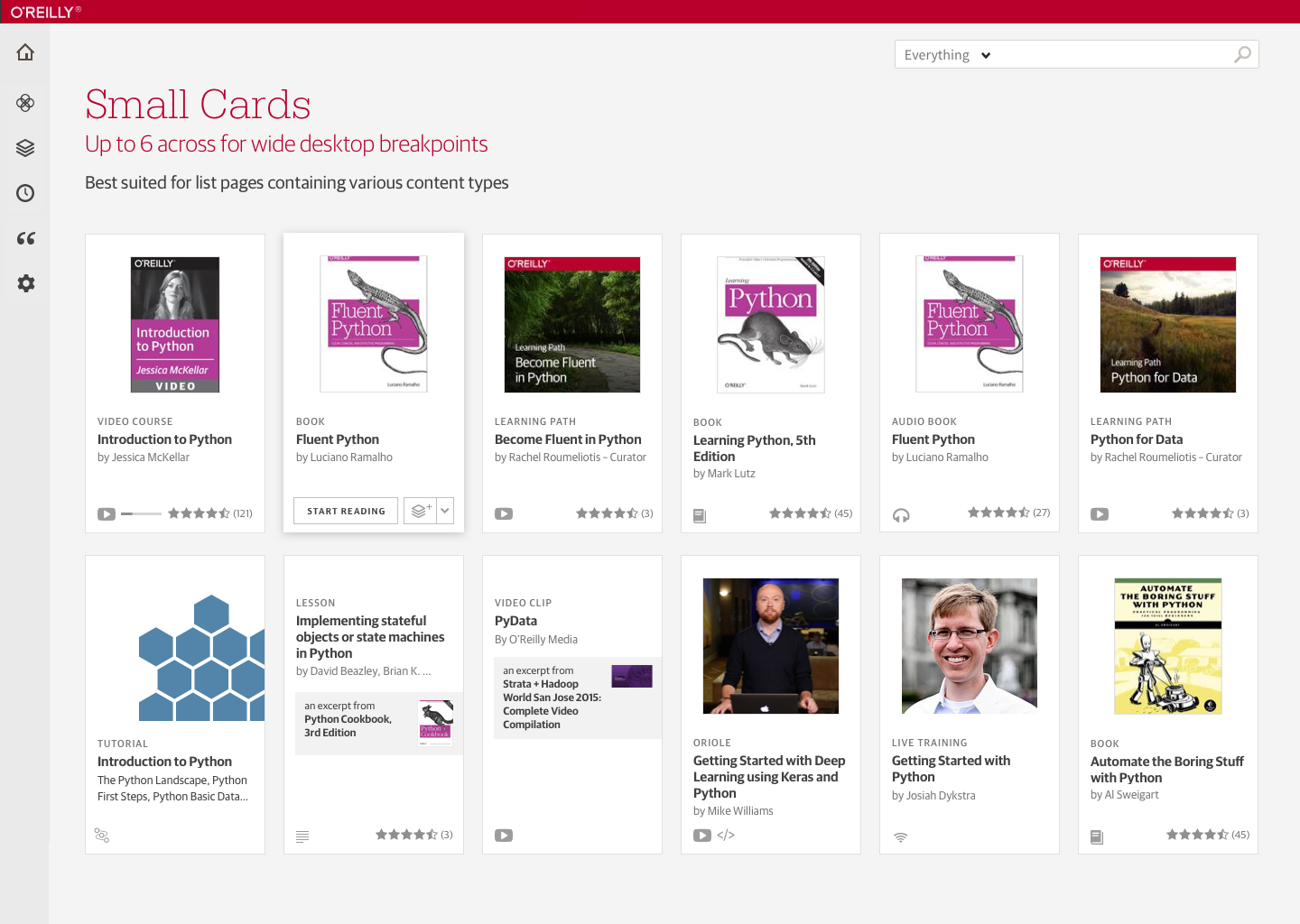
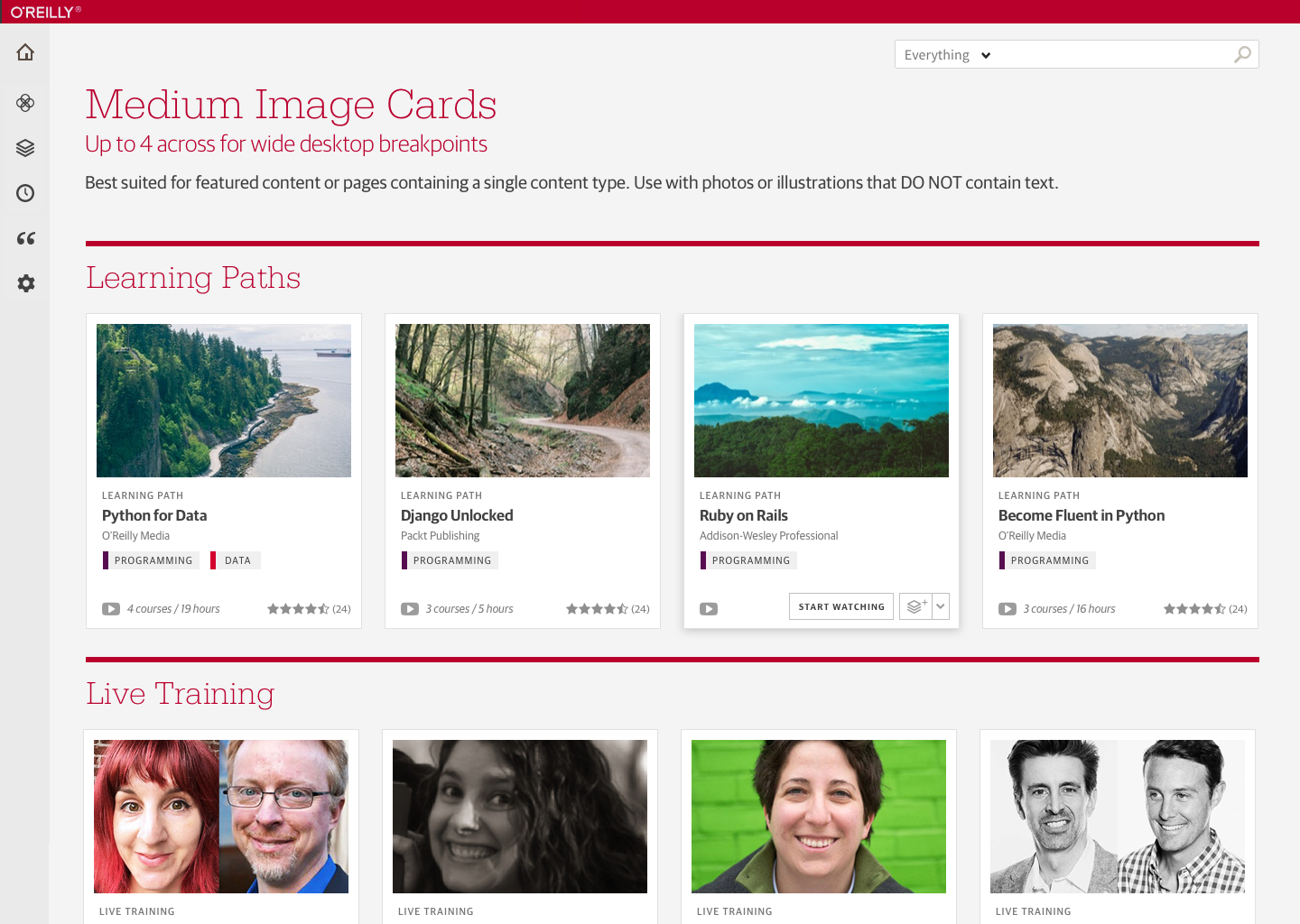
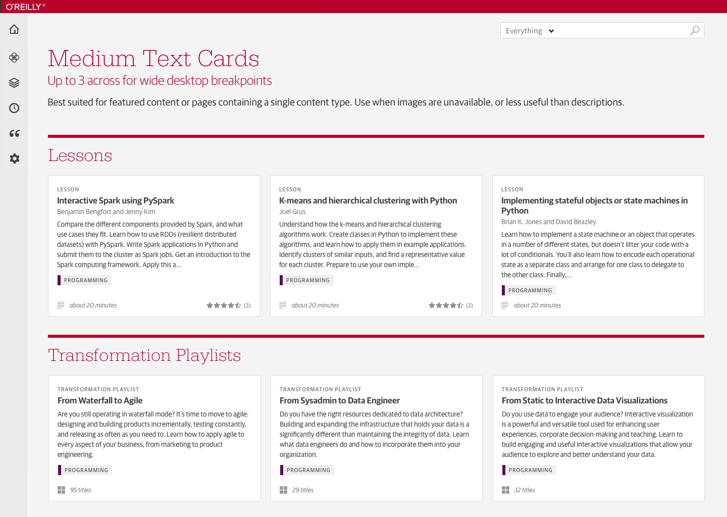
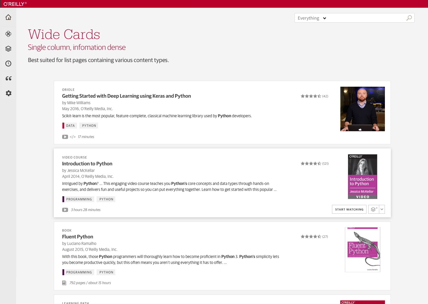
One of my first projects was to was to propose a design system for content lists. I began by creating a design inventory of all the various ways content was represented on the site and mobile apps. I also created inventories of content types the metadata available to each.

Excerpt from my design inventory. The exercise helped to illustrate inconsistencies in design and behavior across the site.
During the design, I experimented with different levels of information density. My goal was to surface just enough info to help users scan, compare, and narrow down their options. I avoided displaying repetitive actions that would clutter and impede ease of scanning the information except on hover.
Based in the principles of atomic design, the central organism of this approach became the "content card" optimized for browsing and comparing options. It was fully responsive for any viewport, and flexible to accommodate the varied content types that would often need to live side by side. I created versions both in Sketch and html/css.

Evolution of the small card layout from left to right: 1) Original card layout, 2) Interim layout that updated the architecture & interactions, but retained Safari's typefaces and color scheme. 3) Final card design, updated to work within O'Reilly's style guide.
The initial pass at the cards pattern was integrated into a few areas of the site, which gave us a chance to see how it worked in the wild, get some feedback, and make some adjustments.
Findings from research I conducted for related projects around navigation, topic hierarchy and search fed back into iterations on the pattern. As new content types and features were introduced, and Safari transitioned to use more of O’Reilly’s branding, the design pattern continued to evolve.

Refresh of the Safari homepage and navigation, featuring the new card patterns.


